
Rules for main forums
- Be nice
- No advertisement
- No events
- No fundraisers
- No topics asking for votes
- Only posts related to Brazilian Jiu Jitsu
Favorite BJJ Gym Logo
4 year(s) ago • 1280 views • 13 replies
 JB
JBBlack belt 1st degreeVerified

4 year(s) ago
Hey everyone! Its been about 8 months since I have opened my studio, revisiting my logo time and time again, I am not sure I love it. Although it represents what I love about Jiu Jitsu, I'm not that sure it would look cool on a Gi or a shirt etc...
Wondering if yall have any opinions about logo's or any favorites.
Wondering if yall have any opinions about logo's or any favorites.
JBBlack belt 1st degreeVerified
4 year(s) ago
Also with the 6+ colors in this logo, printing it can be somewhat expensive depending on who you go see.
 SZ
SZBlack belt 1st degreeVerified
 JM
JMBlack belt 2nd degreeVerified
4 year(s) ago
Ideally, any functional logo works as dualtone.
JBBlack belt 1st degreeVerified
4 year(s) ago
Here's a related topic with several school logos. https://www.beltchecker.c[...]3347db0580
Oh nice thanks so much, there are some unique logos in that thread.
 CG
CGBlack belt 4th degreeVerified
4 year(s) ago
Also with the 6+ colors in this logo, printing it can be somewhat expensive depending on who you go see.
+ you have a gradient in the letters which makes it impossible to do as a screen print.
JBBlack belt 1st degreeVerified
4 year(s) ago
+ you have a gradient in the letters which makes it impossible to do as a screen print.
This has been a troublesome aspect of the design. I love the way the gradient works but you are absolutely right.
Well here is hoping for some good inspiration. Trying to get an iconographic encapsulation of "Mentality" but having
trouble imagining what that could look like.
Well here is hoping for some good inspiration. Trying to get an iconographic encapsulation of "Mentality" but having
trouble imagining what that could look like.
 D
DBlack beltVerified
4 year(s) ago
Your logo is a bit ... mental :) Are you really that stuck with Mentality?
JBBlack belt 1st degreeVerified
4 year(s) ago
Your logo is a bit ... mental :) Are you really that stuck with Mentality?
Absolutely, that’s the main ethos of the gym. No matter where you go people are teaching jiu jitsu, what makes a martial artist stand out is their organization of thoughts, techniques and maxims.
While I am attached to the name, the logo I am not.
While I am attached to the name, the logo I am not.
 SF
SFBlack belt 1st degreeVerified
4 year(s) ago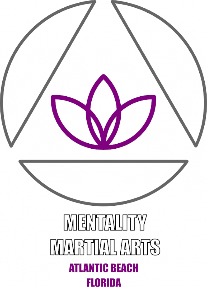
I'd probably go much simpler, you want something that will read well on light or dark backgrounds, uses few colors with no gradients so you can screen t-shirts or embroider patches with it. I'm no graphic designer, but I've attached a concept that's more like what I'd do.
JBBlack belt 1st degreeVerified
4 year(s) ago
I'd probably go much simpler, you want something that will read well on light or dark backgrounds, uses few colors with no gradients so you can screen t-shirts or embroider patches with it. I'm no graphic designer, but I've attached a concept that's more like what I'd do.
Thank you so much for taking the time to mock up an idea. That’s excellent and great food for thought
 MG
MGPurple beltVerified
4 year(s) ago
I’m glad by the time I get to black belt I’ll be too old to go out on my own because choosing a logo could do me in. With that said, I find the more simplified logos more appealing.
 SY
SYBlack belt 3rd degreeVerified
4 year(s) ago
The concept is strong, it communicates peacefulness, mindfulness, strength and unity. The triangle frames the central character and alludes to the historical use of the symbol in BJJ lore.
As others have noted, the gradients are a huge problem when it comes to printing. A general rule of thumb for all branding elements is that you can happily add as many colours and gradients as you want, but ultimately, can it also be reduced down to a single colour and still work and be recognisable. Think of famous logos - Facebook, Twitter, Google etc all of them colourful yet can also be fully recognisable and printable in black and white.
There are work-arounds - graded lines, dots and hatches could replace the gradient itself, although it begins to start look messy with too many interfering marks.
Tonally, the choice of colours is also a problem, potentially - there is not enough contrast and separation tonally between the blues, greys and blacks.
Finally, I personally am not a fan of overlapping text+visual elements, I prefer to separate them. But that's personal preference.
My own logos designs are pretty basic as this is not my speciality. I try to keep things simple and to brief: https://www.behance.net/g[...]ascots-etc
I hope my comments are constructive and helpful as you move forward with this project.
(NB I am not touting for work, I'm too busy to take on new commissions)
As others have noted, the gradients are a huge problem when it comes to printing. A general rule of thumb for all branding elements is that you can happily add as many colours and gradients as you want, but ultimately, can it also be reduced down to a single colour and still work and be recognisable. Think of famous logos - Facebook, Twitter, Google etc all of them colourful yet can also be fully recognisable and printable in black and white.
There are work-arounds - graded lines, dots and hatches could replace the gradient itself, although it begins to start look messy with too many interfering marks.
Tonally, the choice of colours is also a problem, potentially - there is not enough contrast and separation tonally between the blues, greys and blacks.
Finally, I personally am not a fan of overlapping text+visual elements, I prefer to separate them. But that's personal preference.
My own logos designs are pretty basic as this is not my speciality. I try to keep things simple and to brief: https://www.behance.net/g[...]ascots-etc
I hope my comments are constructive and helpful as you move forward with this project.
(NB I am not touting for work, I'm too busy to take on new commissions)
JBBlack belt 1st degreeVerified
4 year(s) ago
The concept is strong, it communicates peacefulness, mindfulness, strength and unity. The triangle frames the central character and alludes to the historical use of the symbol in BJJ lore. As others have noted, the gradients are a huge problem when it comes to printing. A general rule of thumb for all branding elements is that you can happily add as many colours and gradients as you want, but ultimately, can it also be reduced down to a single colour and still work and be recognisable. Think of famous logos - Facebook, Twitter, Google etc all of them colourful yet can also be fully recognisable and printable in black and white. There are work-arounds - graded lines, dots and hatches could replace the gradient itself, although it begins to start look messy with too many interfering marks. Tonally, the choice of colours is also a problem, potentially - there is not enough contrast and separation tonally between the blues, greys and blacks. Finally, I personally am not a fan of overlapping text+visual elements, I prefer to separate them. But that's personal preference. My own logos designs are pretty basic as this is not my speciality. I try to keep things simple and to brief: https://www.behance.net/g[...]ascots-etc I hope my comments are constructive and helpful as you move forward with this project. (NB I am not touting for work, I'm too busy to take on new commissions)
This was a very helpful reply thank you for taking the time to share with me



